Christmas Card Collaboration with Courtney Kroeber

Ho, ho, ho, my merry peeps!

Today’s post is the corresponding blog post for a YouTube video that’s up on my channel today. I’m collaborating with Courtney Kroeber for her 25 Days Of Christmas Cards series and we decided on Copic coloring for our cards.

Now, this might come as a shock as colouring is basically the theme of this card, but I have not used a single stamp set here!! Not a one! Say whaaaaat? I decided to use the Strings Of Lights diecuts from Lawn Fawn and cut out lots of the baubles out of Copic friendly card stock, and these I have coloured.

To get these looking as lifelike as possible, I have used quite a few markers on each one. Going from dark at the edges and lighter and lighter towards the middle.

The screw tops I had to play around with several tries before I was happy with the look. I thought blending the colours would give the most realistic look, but I was so wrong! In the end, what I liked best was using C4 with light flicks, and then going in with C5 to add depth and the illusion of the curve.

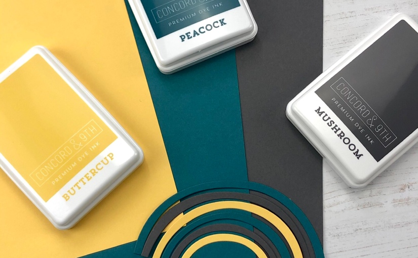
With a huge selection of baubles coloured, it was time to think about the actual card base. I had an idea in my head, and went about trying to make it come to life but man… it was a bit more trouble than I thought! The idea was to use the Take A Bough Encore dies from Concord & 9th and create a Christmas tree look. Sounds cool, right? Whilst I got there in the end, it ended up being a very heavy card! This is not one to be sent in the mail, unless you are happy to pay a lot extra for postage.

First of all I cut out a slim line panel using the Slim Line Diecutting System from Picket Fence Studios. Using this as a guide, I then absolutely COVERED it with the Take A Bough Encore pieces. These, and the background panel, are all cut out of Evergreen card stock, from Concord & 9th. When I had a good coverage around the edges, I covered them with a strip of Press’n’Seal and picked them all up. To make sure all of them would stick to the background panel I used Pritt-stick glue. Yep, very old school indeed!

When the edges glued down, I just had to cover the middle with the larger boughs. To make sure the tree looks lifelike, I didn’t cover the backs of the bough dies with glue, only the middle part.

With my “tree” done, I could start the decorating with the baubles! I cut out lots of extra string from the diecut set and then got puzzling. What I realised here though, is that I should have coloured up more of the smaller baubles, instead of going to town with the bigger ones. Admittedly they were easier to colour.

As it’s pretty obvious what occasion this card is for, I didn’t add a sentiment to the front of it. The Man actually said ‘Nobody is going to look at that and think Happy Easter’, lol!

Well, that’s it from me but I hope you get a chance to hop on over to my YouTube channel to watch the video, and then drop by Courtney’s channel to see what she made.

I have used some compensated affiliate links in this blog post, at no extra cost to you, for your convenience. Thank you so much if you shop using these links, I really appreciate the support!

Lots of love and happy crafting from Erica

Slim Line Rainbow Cards with WOW! Embossing Changers

Hello, hello!

Today’s cards are another couple of slim line cards. It seems I can’t stop, and won’t stop, with these for a while. Oh well, things could be worse, right?

To make these I started out by cutting panels of white card stock with the Slim Line Diecutting System from Picket Fence Studios. On the smaller rectangles, I adhered strips of coloured cardstock to create rainbows. The card stock I’ve used for these is from Lawn Fawn, and you can get it in a handy Rainbow Pack if you don’t want to invest in 10 sheets of each colour.

On the right one I’ve used, from left to right, Raspberry, Chili Pepper, Canned Pumpkin, Fake Tan, Sunflower, Cilantro, Peacock, Blue Jay and Sugarplun.

On the left one, I used Raspberry, Chili Pepper, Canned Pumpkin, Fake Tan, Sunflower, Cilantro, Peacock and Mermaid. It gives a more pastely look than the top one with the blue and the purple.

I’ve used a few different diecuts to make the sentiments, and the big Hi Die and Friend Die, are from The Stamp Market. The Happy Birthday is from MFT Stamps. Both the Friend and the Happy Birthday have been cut out of white card stock a few times and layered up.

The Happy Birthday one was then heat embossed with Glisten Changer to make it sparkly. This particular one has been retired, but HERE you can find a really good alternative.

The Friend one I heat embossed with Clear Gloss to create that puffy sticker look. I love doing my word diecuts like this, it just adds something extra!

For the clouds I have used some Stitched Cloud Dienamics from MFT Stamps, on white card stock. For a little while longer you can find the EXACT ONES at Ellen Hutson!

These I have jazzed up by heat embossing them with the WOW! Changers Texture and Glisten. The way these powders work is that you can change your embossing powder to either be sheen, glittery or texture. All you have to do is mix your choice of powder with whatever effect you want.

I haven’t used the Texture one before so I decided to use it for one of the cards! For the second one I used Glisten, which I am obsessed with. Both powders are mixed with Clear Gloss and the pieces were dabbed with the Embossing Pad, covered in the powder mix and then set with the Heat Tool.

With these cloud bits done, I glued them to the rainbow panels. I did have to use both tape runner and Lawn Fawn glue because of the heat embossing, and I also left them under flat weights to make sure they dried flat.

On the first one I glued down the Happy Birthday with Glossy Accents, as I ran out of my Lawn Fawn Glue Tubes!! SEND MORE STAT!!!!

The second card was finished with the big Hi and the Friend diecuts. The Hi I layered up with fun foam, cut with the diecut, to add height. The Friend I added on top of the Hi and with that, the card was done.

I actually managed to make a bonus card with the outline from the Hi die too. It seemed a shame to waste it, when I had a load of rainbow card bases done already.

Using a Nuvo fine tip glue pen, I adhered the outline Hi to a card base and ta-da! Another card done!!

On my YouTube channel you can also find a video of the making of the slim line cards, if you fancy seeing the Changer powders in action.

I’ve used compensated affiliate links in this post. What that means is these links goes to shops I’m affiliated with, and as a thank you for sending you to them, I will get a small commission directly from them if you buy something. This doesn’t cost you anything extra at all, but it really makes a difference to me if you do use these links. Any earnings I get from these links go directly back into the running of my blog, YouTube channel and keeping my Instagram fresh, fun and inspiring for you, so thank you if you choose to support me like this. I really appreciate the support!

Lots of love and happy crafting from Erica

You can find me on various social media platforms if you want to see more of my work

My blog (that’s right here)

Instagram

My YouTube channel

CaCaCraft on Facebook

Below you can find affiliate links to Ellen Hutson. Here I have added some good alternatives, when the exact product used was not available.

E

World Card Making Day part 2, A Celebration and A Giveaway!!

Hi, me again! Yes, back for the second time in one day BUT I’m here with another fun post AND another giveaway! Am I forgiven yet?

Over on Instagram I am nearing a whole 10 000 followers, and whilst we shouldn’t care too much about numbers and the likes etc, 10 thousand is a pretty big number. My lovely design team wanted to celebrate with me so we set up a little instagram hop with lots of prizes and a grand prize of $100 gift voucher from Picket Fence Studios! Oh yes! You can find me on Insta HERE, look for the post with photos of this card for rules and how to enter. There is a prize bundle up for grabs!

There is also a prize bundle up for grabs here! All you have to do is leave a comment on this blog post to be in with a chance to win the brand new slim line diecutting system that will enable you to create 256 different slim line card fronts!

The design team are also having a little blog hop, the full list is below:

Picket Fence

Erica

Lisa

Michelle

Angela

Ilina

Lydia

Karen

Ceal

Now, for my actual card: I have used the Broken Fence Slim Line stencil with almost ALL of the Paper Glazes. Oh yes, why use just one or two when you can use ten?? Well, in fairness, I had to use loads of them as I wanted to create a rainbow. Yes. Another one. I’m obsessed and I do not want to go to rehab for it!!

First of, I got a piece of card stock out that was almost as long as the stencil, 10 inches, and trimmed it down to about 4 inches wide. After spraying the stencil with the magical Pixie Spray and letting it cure for a few minutes, I adhered it to the panel. Now for the tricky part! Getting all the Paper Glaze through the stencil and onto the paper before it dries too much on the actual stencil is no mean feat. This stuff dries very quickly, which means you have to work very quickly too.

I prepped my workstation with kitchen roll to wipe my spatula with in between colours, so I don’t contaminate any, and then I dove in! As I wanted a very textured and chunky look, I didn’t need to smooth the Paper Glaze much. I literally just slathered it on, smoothed a little bit to blend in the previous colour and then moved on to the next one. The effect is gorgeous as the glaze dries shimmery. From left to right I’ve used Fern Green, Leaf Green, Jade Vine, Ocean Poppy (not pictured) Cornflower Blue, Agapantha Purple, Peony Pink, Marigold Orange and Daffodil Yellow.

When this was dry, I trimmed it down just a smidge to just under 8.5″ long and 4″ wide. I made a card base from Neenah 110# card stock and used Pritt stick glue to adhere the panel to it. I tend to use glue sticks when I have used lots of paper glaze, glimmer paste and water colour. I have found that my usual adhesive isn’t strong enough to hold the panels to the card bases when they are so laden with product.

To finish the card off, I used the Seriously word die(this one is discontinued but will be replaced with another font soon) and a gold heat embossed sentiment from the Seriously, Literally, Always stamp set. Together it makes a really lovely sentiment that would make any of your friends happy to receive. These bits were adhered with a generous blob of Lawn Fawn liquid glue.

Right, with that, I’m all done for today! Now it’s time to hop along, both in the blog hop and the Instagram hop, for your chance to win some yummy prizes!

Lots of love and happy crafting from Erica

As always, I have used compensated affiliate links in this post, at no extra cost to you. If you shop using these links, I get a small commission from the company it’s linked to at absolutely zero extra cost to you, as a thank you for directing you to that shop. The income I receive from these links go back into running my blog, YouTube channel and keeping my Instagram fresh, fun and free for you so thank you if you choose to support me this way. I greatly appreciate it!

You can find me on various social media platforms if you want to see more of my work

My blog (that’s right here)

Instagram

My YouTube channel

CaCaCraft on Facebook

You Say Witch Like It’s A Bad Thing! | STAMPtember 2019

Hi guys!

Today’s card is made with one of the Simon Says Stamp STAMPtember set from last year, If The Hat Fits, combined with their Spider Web Background stamp. I’m not much into Halloween and scary stuff, that’s just not my jam at all. Making Halloween cards, however, I for some reason, love making!

I started out by stamping up two of the hats on Neenah card stock with Black Hybrid ink from Picket Fence Studios, as this is Copic friendly.

I used quite a few of the Cool Grey Copics to colour in the hat, but still getting some highlights and contrast to it. Both hats were done in the same colours and the accessories were done in “witchy” colours.

Thankfully for me, as I’m not a fan of fussy cutting, there are coordinating diecuts for this set too, and I used them to cut out the hats.

The background is the Spider Web Background stamp, heatembossed in Opaque Bright White on Eggplant card stock from Concord & 9th. For some reason, despite using an anti-static tool on the card stock first, there was a lot of stray powder all over it and it felt too fiddly to try cleaning that up. The effect was sort of a dusty spiderweb, which actually worked out pretty cool.

To make it look a bit spookier, and also to draw the eye in, I ink blended some Black Soot with a Life Changing Blender Brush around the edges. Doing this works really well with coloured card stock, if you want to add a more dimensional look to your background.

That little piece of acetate with the PostIt tape is a clever little tool I use to keep my fingers off my project, both to avoid finger prints on my ink blending and smudging the ink. It’s super inexpensive and works a treat. After doing the ink blending, I splattered some gold water colour on it and set that aside to dry.

I also heat embossed one of the funny sentiments, from If The Hat Fits, in white on black card stock. This piece I cut out with the Stitched Circle dies, and did another one in white card stock, in the next size up.

To finish off the card I adhered all these bits and pieces to the background with Lawn Fawn glue tube. For an extra pop, I added some Glossy Accents to the green ribbon hat and to the buckle and the moon, on the other hat.

The last finishing touch were some matte black and iridescent black sequins, which I adhered with more Glossy Accents.

With that, I’m all done! I hope you found some inspiration where with me today. If you did, I’d be ever so grateful if you would use the compensated affiliate links provided in this blog post. Using these do not cost you anything extra at all, the company the links are affiliate to, pay me a small commission directly as a thank you for directing you to them. These earnings, however small, help keep my little blog, YouTube channel and Instagram feed fun and fresh for you, so thank you if you use them! It means a lot to me.

Lots of love and happy crafting from Erica

You can find me on various social media platforms if you want to see more of my work

My blog (that’s right here)

Instagram

My YouTube channel

CaCaCraft on Facebook

MFT Stamps Sketch Challenge 501

Hi!

Today’s post is based on this week’s MFT Stamps Sketch Challenge #501 and I’ve not done one of these for a while, so I thought why not?

I really wanted to use the cute dragons from the BB Magical Dragons set. With that in mind, I stamped them up on Copic friendly card stock with the PFS Black Hybrid ink, set it with my WOW! heat tool and got to work with Copics. My first dragon was done in what I picture to be a natural colour for dragons: green!

My second dragon was done in more teal-like colours, maybe she’s a girl dragon? The tummies, horns, wings and back scales on both of them were done in lighter, but still matching colours.

There were two fire bursts stamped up too, so I did these in flame colours. Deep reds with some fiery yellow. I’m so glad this set comes with coordinating Dienamics as fussy cutting is not my jam.

The background I did with the Mini Cloud stencil, one of my favourite stencils ever. I wanted a really soft look, so I didn’t add any more ink to my Life Changing Blender Brushes, just used the blues left on them. It turned out fab!

One of my newest purchases is Sparkle Spray by Nuvo Tonic Studios, and I wanted to add some sparkle to the background with this. Buuuuut… I went a little overboard, which left the background COVERED in the sparkle spray. This one is Morning Fog, and wow! I think I will be adding a few more to my arsenal.

To finish off the card, I stamped up a couple of the sentiments from the BB Magical Dragons set with Black Hybrid ink. Then I adhered the dragons and the fire bursts with Lawn Fawn liquid glue, added a little bit of Wink Of Stella to the wings and horns, and with that, the card was done! I was originally only going to add one of the fire bursts but as I went overboard with the Sparkle Spray, and it kind of looked like ash in the air after the dragon had gone to town breathing fire, I added both.

Thanks so much for stopping by today, I hope you enjoyed this card and found some inspiration here with me. I have used some compensated affiliate links in this post, at no extra cost to you. If you shop via these links I get a small commission from the company directly. Any earnings I get from these go directly back into the running of my blog, YouTube and Instagram so thank you so much for supporting me by using these. I really appreciate it a lot!

Lots of love and happy crafting from Erica

You can find me on various social media platforms if you want to see more of my work

My blog (that’s right here)

Instagram

My YouTube channel

CaCaCraft on Facebook

Concord & 9th Feature Friday Colour Spectrum

Hi Concord & 9th fans!

Today is the last Feature Friday of the month of July, and the theme is Colour Spectrum. Which basically means another excellent excuse to use ALL! THE! COLOURS!! It is no secret that I fell head over heels for the Assorted Cardstock and the ink pads.

I’ve got four cards to share today because yet again, I could not stop the all rolling, once it started. Eh, it happens. More often than not, in my case, but whatcha gonna do? I did make a video for this post as well, you can find it over on my YouTube channel.

The first two cards are very clean and simple cards, which are starting to come so much easier to me. Maybe because there are so many colours on them thanks to the coloured cardstock? That seems like a reasonable explanation, as usually I feel like keeping things clean and simple is such a struggle for me.

First things first, I used the Tall Types Tagalong Dies and cut out the rainbow out of all the colours, except Dove, Mushroom and Wheat. After separating out all the pieces, it was time to build rainbows! With the help of a ready made card base I placed them where I thought they should go, and then picked them up with some Press’n’Seal. I added some liquid glue to them all and placed the white card base on top, pressed down, turned it over and removed the Press’n’Seal. Ta-da!

Because I had enough rainbows to make another card, I did just that! The idea was at first to only make one card like this, but as mentioned before, the ball was rolling so I went with it. Next time I think I’m going to use the balloon and make a birthday card, and then the star to make a congratulations card. Oh, so many possibilities with this fun Tall Type Tagalong set! I also L-O-V-E the Tall Type Alphabet and Tall Type Number dies. (As seen in the top photo in this post)

In order to keep the cards clean and simple, because I really could have gone over the top, I simply stamped a sentiment with Dove ink on white card stock and cut it down to a slim banner. Both of the sentiments are from Tiny Tagalongs stamp set.

I had such a strong urge to add sequins to both cards, because you know.. Hi, I’m Erica and I’m a over-sequin-izer/sequin addict. It was quite card to keep the sequins away because I really do think it would have added a little extra pizzazz to them.

The second two cards were so fun to put together! Thin strips of the coloured card stock were cut with a paper trimmer and then adhered to a thin sheet of paper, in colour order. Again, leaving out the neutrals.

On this rainbow-licious panel I used the Say Hello die twice, so I had two almost identical Hello’s. I also cut out a thin Hello out of black and white card stock. This Say Hello die has a coordinating stamp set, and you can get them both in a discounted Say Hello Bundle.

There were a few little bits and pieces that fell out as I used a tape runner, rather than double sided adhesive sheets. Which would have been a smarter idea. Once that was fixed, I adhered the rainbow Hello’s and the white and black ones on top. These were then adhered to white card bases.

From the Hey Bestie stamp set, I stamped up one of the sentiments, in Mushroom ink, directly on top of the cards.

Again, I really wanted to add some sequins to the cards, but managed to resist the urge! That feels like a major win, and even The Man was impressed I kept them sequin-free. I do think there will be a heavily sequin-ized card coming up in the near future, lol!

Well, that is it from me for today. I want to extend a big, huge thank you to Concord & 9th for having me for this month, I have several other blog posts and YouTube videos for the Feature Friday posts if you missed those. I have used some compensated affiliate links in this post, most of them to Concord & 9th of course, and then some to some other companies I’m affiliate with. If you use these to pick up a little something-something for yourself, I might get a small commission from the company directly, at no extra cost to you whatsoever. Any earnings I get from these go directly back into the running of my blog, YouTube channel and keeping my Instagram fresh and fun for you.

Thanks for stopping by today, I hope you found some inspiration here with me. Lots of love and happy crafting from Erica

You can find me on various social media platforms if you want to see more of my work

My blog (that’s right here)

Instagram

My YouTube channel

CaCaCraft on Facebook

Concord & 9th Feature Friday: Color Focus!

Hi guys!

Today’s post is another Concord & 9th Feature Friday, and this week we all had to pick two colours each to focus on. My two picks were Ballet Slipper and Cranberry. Which might come as a surprise given how much I’ve been loving my teal and aqua colour combos recently, but I really do love these two colours.

The Ballet Slipper pink is such a soft, romantic colour and for my project for it, I decided to go for a CAS look. Lots of white space and some gold splatters were the perfect accompaniment to keep the actual pink in focus. I used the Lace Leaf stamp and coordinating diecut and started out by stamping the shadowy bit with Ballet Slipper directly onto a white card base.

Slightly off-centre from this, I stamped the Lace Leaf. First with Ballet Slipper, and then on top of that, once more with the Embossing Pad from WOW! Embossing. I used Clear Gloss embossing powder to make the Leaf image stand out a little bit more but still keep the pink in focus.

I used the ‘Grateful’ word die, that is part of the Lace Leaf coordinating diecuts, and cut it out of white card stock four times. The top layer is cut out of a piece that had the shadowy bit of the stamp stamped up with Ballet Slipper on it. This is a fun way to make your word die a little more interesting.

To finish off the sentiment, I also heat embossed ‘for you’, from the stamp set in the bottom right corner. This is done in gold embossing powder. One last finishing touch was to splatter some water colour gold all over the background, and with that the card is done!

For my Cranberry project I have used both ink pad and cardstock, as well as my beloved Tall Type Alphabet dies and Coffee Blend Turnabout stamp.

First, I stamped up the Coffee Blend Turnabout stamp on a panel of Cranberry card stock, with Cranberry Ink! It looks so freaking fabulous with that perfect tone-on-tone colour. The MISTI and the Turnabout Jig makes turning so easy.

Using more Cranberry cardstock, I cut out the letters needed to spell out ‘I love you’ with the Tall Type Alphabet dies.

I also cut them out three times out of white card stock and layered these up with Lawn Fawn liquid glue adhesive. The O in the middle of ‘love’ is the heart from the die set.

The letters I placed on the card, using more liquid glue but it needed a little something else. It wasn’t quite right. The solution was to make the sentiment say ‘I love you more than coffee’, so I stamped up the ‘more than coffee’ from the Coffee Blend Turnabout stamp, on white card stock with Cranberry ink. Trimmed that down a little and adhered it to the ‘you’ part.

It still needed a little something else. At least I felt like it did. I mean, I am the queen of over-doing it so maybe not? However, I did add Glossy Accents to the coffee beans on the background and also to the heart diecut on the card.

Well, that’s it from me for today but don’t forget to check out all the other guest designers to see what colours they chose and what they came up with! As always, I have used compensated affiliate links in this blog post, most are to Concord & 9th. If you shop using these links, I get a small commission directly from the company, at no extra cost to you whatsoever. Thank you if you support me by shopping with these links. I really appreciate it!

Lots of love and happy crafting from Erica

Concord & 9th Feature Friday: Favorite Paper or Ink Technique

Hello, hello and happy Friday!

Today’s blog post is another instalment in the Concord & 9th Feature Friday series. This week we were challenged to show cards made using our favourite paper/cardstock or ink techniques. As most of you know by now, I do love me a colourful background. Yes, Siree, I do!

Ink blending is anther favourite of mine but for this post I am going to stick to mainly the card stock background one. To start with, I cut strips of the coloured cardstock into two different widths. Why not, eh, while you have your paper trimmer out??

The skinny cardstock strips, 0.6cm/0.25inches, I fanned out. To keep the pieces in place, I used PostIt tape, but low tack washi will work too. Add a little bit of adhesive to each strip, and add to a card base. I did put mine under my MISTI for a bit to make sure it dried flat and all the pieces adhered to the card base. Once the glue is dry, trim off the excess with sharp scissors.

Using the wider cardstock strips, these are about 1,25cm/0.5inches, I separated them into 2 piles based on colours that would work well together. These were then adhered to a card base each, and the excess trimmed off. If you use a lot of coloured card stock you can get a HUGE card stock bundle, with 12 sheets of each colour. If you prefer to try a small selection, get the Assorted Cardstock bundle, where you get 2 sheets of each. Then you can buy bigger single packs of the colours you end up using a lot.

The card with the skinny strips was finished with a simple sentiment from Hey Bestie, cut out with the coordinating diecut. The stamp is done with a mix of inks to create that marbled look. I used Buttercup, Sprout, Parsley and Aqua Sky. Of course I had to, HAD TO, add a generous sprinkle of sequins.

I love the simplicity of this card and the colourful background is my fave out of the three.

The next one I tackled was the darker one of the two backgrounds, and I used the gorgeous Swirls die on it to give it some texture. For the sentiment, I kept it simple again and stamped up ‘Hey Bestie, I love how we just get each other’ in Dove on white card stock. This is cut out using the small hexagon die in the Hexagon Label dies set. These two come in a Hey Bestie bundle too.

I did add some black and silver thread behind the sentiment, which is popped up with some foam tape, and that was it. Oh, and I did poke out all the little holes from the die, rather than keep them in. I like the little white polka dots added to the background.

The final card has a sentiment, and little details, added to it from the Crafty Turnabout stamp and coordinating die set. This, of course, also comes as a Crafty Bundle, if you know you want both.

All the crafty details are cut out of the coloured cardstock , except for the blades of the scissors and the painbrush binder, which is silver glitter card stock. The sentiment is stamped up with Mushroom and the COLOR bit is done with a colour each: Sprout, Oceanside, Midnight, Honeysuckle and Cranberry.

The sentiment block, the scissors and the paintbrush are popped up with foam tape and the rest of the details are adhered with Lawn Fawn glue tube adhesive. A little bit of white Posca pen were the last little details on this one.

I love that sentiment, and it’s so perfect for us crafty people, isn’t it? A handmade card in the mail is like a ray of sunshine on a rainy day.

Right, as mentioned in the beginning, I do also LOVE ink blending. It’s my jam! The first time I tried ink blending with these inks, I did not get very good results… BUUUUUT, I realised I had used the wrong kind of paper. So naturally, I tried again, and ooooh, what a difference!

This is Strathmore Bristol Smooth, and I got not very good results on Strathmore Bristol Vellum. The packaging looks very similar but there is a BIG difference in the paper. The Smooth, is in fact, very smooth and the ink just glides on it. On the Vellum kind, I got a blotchy result and not very vivid colours. So take an extra minute to check the paper you are buying is the right kind, it will make a world of a difference!

The inks I used are Sea Glass, Aqua Sky and Oceanside and they are ink blended using Life Changing Blender Brushes from Picket Fence Studios. I also added a little bit of gold splatter on it, because why not, eh? This is one of my other favourite things to do: Ink blending and adding texture by either splattering water or metallic water colours on top. I loved this combo so much, I made several backgrounds with them.

Okey-dokey, that’s it from me for today! I hope you found a ton of inspiration here and will try some of these techniques for yourself, if you haven’t already done so.

Lots of love and happy crafting from Erica

Compensated affiliate links are used throughout this post, as always they do not cost you anything extra at all if you shop through these links. Any earnings I get from these go straight back into the running of my blog, YouTube and instagram to keep the content fun and fresh for you. Thank you so much in advance if you choose to support me by using these links. I really appreciate it!

You can find me on various social media platforms if you want to see more of my work

My blog (that’s right here)

Instagram

My YouTube channel

CaCaCraft on Facebook

Concord & 9th Feature Friday Favourite Colour Combos

Hi guys!

Welcome back to more Concord & 9th fun-ness! Today it’s a Feature Friday and we are featuring our favourite colour combos. I have a blog post HERE showing swatches of the inks and card stock, as well as a YouTube video HERE.

First I have a card, with a bold combination of Buttercup, Peacock and Mushroom. I’ve used both inks and the coloured cardstock for this card, and the Rainbow Wishes Bundle. You can get the Rainbow Wishes stamp set and Rainbow Wishes dies separate, if you don’t want the bundle.

I started out by cutting the rainbow bits out of the Buttercup, Peacock and Mushroom card stock, and puzzled these around a little.

On a card base, I stamped the cloud image in the coordinating ink colours Buttercup, Peacock and Mushroom on an angle.

In the gaps between these I also stamped up some hearts from the Rainbow Wishes set. I used the third ink colour in between the gaps, to create more contrast.

On the clouds, which come with the dies, I heat embossed the same cloud stamp in white to add more interest. With all these bits and bobs done, I puzzled the rainbows and clouds onto the background until I was happy. Then with the help of Press’n’Seal I picked up all the pieces, added liquid glue to them and simply adhered them to the background.

I nearly left it like this, but then I thought it needed a little something else. To fix it, I stamped up ‘You’re one of my favourites’ in Buttercup ink on white card stock. This sentiment is from Hey Bestie.

This I then trimmed down and adhered to the card. Then I decided to stop there. Although, I itched to add some sequins, I managed to step away and leave it without bling! *Insert gasps of shock here*

For my next project I used the new flower dies, Fresh Cut Flowers Edition 1 and Fresh Cut Flowers Edition 3. Again, I used Buttercup card stock, and also Grapefruit and Sorbet cardstock. For the leaves I used Sprout and Parsley.

All these bits and pieces I have puzzled together with liquid glue. Some are the same colour, some are mixed. I had so many pieces because I really wanted to play around and see what it would look like with some combos.

I ended up with two flowers, one has all the same colour on each level and the other ones has both same colour pieces and mixed bits. I used foam tape in between some of the layers to create height, like a natural dahlia has. The top one has three, or maybe even four layers of foam tape!

In this photo you can really see how high and dimensional it really is. The bottom flower is still lovely and dimensional, but holy cannoli, the top one really is lovely! If I may say so myself.

Well, that’s it from me for today but I will be back with annoying frequency this month, harping on and on and on about these luscious colours. I’m not even sorry, lol!

I have used some compensated affiliate links in this post, so if you click on any of these and end up buying something, I will get a small commission directly from Concord & 9th. Any earnings I get from affiliate links to directly back into running this blog and my YouTube channel. Thank you so much if you chose to support me by shopping these links.

Lots of love and happy crafting from Erica

You can find me on various social media platforms if you want to see more of my work

My blog (that’s right here)

Instagram

My YouTube channel

CaCaCraft on Facebook

Picket Fence Studios June Release!

Hello, hello!

It’s the 14th, which means a new release is available from Picket Fence Studios! You can find the entire release HERE if you can’t wait to see what awesomeness is now for sale in the shop.

I have two cards to show you today, both made with the After The Storm stamp set. Both are coloured with Copic markers, but in true Erica style, both are different. I started out by stamping up the images I wanted to use with Hybrid Black Ink, and then I set it a little by using my WOW! Heat tool on it.

I wanted to make the clouds dark, ominous and look like they were ready to unleash some thunder on my first card. This look was achieved by mixing Cool Greys and some blues, as can be seen on my little tester piece above. I also have a video for this over on my YouTube channel if you want to see it more in-depth.

Once the clouds were done, I used some rainbow colours to colour in the… erm… rainbow. Like, duh. Of course I used rainbow colours! What else?? The markers I used can be seen in the photo above.

To match the rainbow on the image, I wanted to add colour to the word ‘rainbow’ in the sentiment too. With the help of my Mini MISTI, some PostIt Tape and the Atelier Inks from Ink On 3 this was a breeze!

From left to right: Marilyn Red, Marigold Orange, Bee Sting Yellow, Goddess Green, Peacock Blue and My Jam Purple. In other words, the exact colour order as the rainbow itself. Pretty neat little details, right?

To add more drama to the card, I cut out a mask and placed over the image, then I ink blended some leftover Chipped Sapphire ink onto the background. The ink that was left on my brush from another project, was just enough to add some depth. I didn’t need to get the ink pad out again. Cool, huh?

Because I’m addicted to shimmery things, I had to add some gold splatters to the card too. This I did by mixing up some Golden Rose Paper Glaze with water and splattering over the background. I removed the mask first though, as I wanted the gold all over.

This works so well! Paper Glaze really is such a versatile product! The last thing I needed to do was add the sentiment strip and the card was done.

Time to move on to card no2!

For this card I used Cool Greys again, but started with C5. On card no1 I used C7 as the darkest colour. I also created lots of texture on the clouds on this one by dabbing C00 LOTS all over the finished coloured clouds.

This rainbow got more depth and detail added to it, but using two shades of each colour. I also used the same ones, and a few extra, for the umbrella. The wellies in the image I did in a dark teal as I have a pair in that colour.

The bench was coloured in with browns, and I added a little bit of a shadow under it too. Because the sentiment was already stamped up, once the colouring was done, the card was done.

Easy peasy! I’m getting better at leaving white space and not feeling the need to fill in every single little gap with colour. Which one is your favourite? I must admin that I do love the gold sparkle on the first one and the dramatic clouds, but I like the colours used on the second one too.

Well, that’s it from me for today, but I will be back tomorrow with more cards and inspiration! If you can’t wait to shop the new release, I’d be so grateful if you would consider using the compensated affiliate links provided in this blog post. They do not cost you anything extra at all, if you do use them, the company it’s affiliated with, Picket Fence Studios for the most part in this blog post, pays me a commission directly. Anything I make from these, go directly into the running of my blog, YouTube channel and Instagram fresh and fun for you.

Thanks again for stopping by! Lots of love and happy crafting from Erica

You can find me on various social media platforms if you want to see more of my work

My blog (that’s right here)

Instagram

My YouTube channel

CaCaCraft on Facebook